Interview with the artist: Emanuele Pangrazi
29th Jul 2019
Italian awarded designer and creative director who works for companies globally, Emanuele Pangrazi would be better defined as a designer in constant evolution, a bit of a philosopher and a bit irreverent. He graduated in industrial design with a master's degree in digital art, he lives and works between Italy and the United Kingdom, taking creative inspiration from very different places. Thanks to the studies and the experiences gained over the years, he has become very successful in designing hi-tech, furnishings and ceramics products. The passion for his work is manifested in careful and continuous research, in the observation of reality and memory. This contributes to the birth of objects with a material and deeply conceptual awareness. Following this vision, in 2008 founds Mater, a studio in which observations, memories, values, circulate freely in a flow of ideas and solutions.
What’s the best thing about your job?
This work gives me the opportunity to kill boredom, the monotony of everyday life, it's a game and I'm very grateful for this. Working in different fields of design I can always learn new things. I apply a method, I am always myself, but in new worlds or environments. Feeling a stranger gives me a great sense of freedom ... for this I always gladly accept new challenges...
Please tell us more about the project you’re discussing with us:
The Outline Colours wallpaper collection
What influenced you for this design?
For this collection I found very interesting transform simple archetypes like bricks or lozenges etc, elements that are already very common, in flat graphics elements. An extreme synthesis that has made the graphics a fulfillment of full and empty spaces, an alternation of colors inspired by the pastels of the Italian artist Morandi.
How long was the process from the idea to the finished work?
About a month between tests and colours choice.
How would you describe the look and feel of this work?
Being a collection with different graphics and colors, it offers many connotations ... from the most delicate and fresh colors up to a more daring character for some shades of colors. However, all the pieces have a soft look
What were you interested in when you were a child and how did that lead you down the path to where you are now?
As a child I was attracted to toys like everyone else, but unlike others, I always ended up taking them apart, I was interested in seeing how they were inside ... but then I almost never managed to reassemble them and this caused me a great frustration .... then the toy was gone ... Another thing I liked to do was to look at my mother while she was sewing, I followed her through the whole process, from cutting the fabric to choosing details and buttons .... the buttons ... I was always playing with these, I remember a large metal box where my mother kept them preserved, of all shapes and colours.
What I do now is exactly what I used to do as a child, a game, albeit very serious, and I see the design as the combination of technique and art, logic and creativity.
What design tools, equipment or softwares do you use?
It depends on the type of concept I have to develop, but generally in the very first phase of developing a concept, I use the pen a lot and a notebook to take notes and make drawings and ideograms. Recently I also use an IPad with a graphic pen, very convenient for freehand drawing and making presentations during my travels. I love to draw, but I also have a strong competence with digital tools, which I studied in depth and started to appreciate during a master's degree in digital art that I did after graduating in industrial design. So, when I feel that the idea is ripe for further study, I use the computer to verify the idea and develop a presentation. I use Photoshop, Illustrator for 2D, Rhino and KeyShot for 3D modelling and concept rendering, while if I have to create an image of great visual impact, I use Maxwell Render and, in some cases, VRay.
What are your favourite places or things to do, to get inspired or destress?
I like traveling and watching people in their environment. I don't like being a tourist with a camera, who tries to capture everything they see for future memory. Personally, I love being in places and looking with eyes, breathing the unmistakable smell of every place. Often, I sit on the ground or on a step and try to listen, to fuse myself with the environment, I am there and I meditate, I let my mind go ... whether I'm in a park, on a beach or in a big crowded city.
What is one of the most challenging aspects of your job?
One of the most difficult aspects to face is to always be present in the mind of potential clients.
I am a consultant designer and I decided to live in a lovely but small place, away from the epicentres of design, like Milan or other European capitals. This is why I have to travel a lot and keep enthusiasm high. It's a struggle.
Often our greatest strength is also our greatest weakness, what is yours and how does does it affect your work?
Yes, I'm a little maniacal, I love doing many different things and checking all the details ... This way of doing things takes a lot of time and sometimes limits my creativity. Although some of my clients really appreciate the result, I often do more than what is required, and this is not a good strategy for my business. I think it has to do with the passionate aspect of my character. I'm working on myself to have a lighter and more carefree approach to the project.
Where can people find out more about what you, and how can they get in touch?
Website: www.emanuelepangrazi.com
Facebook: emanuelepangrazi
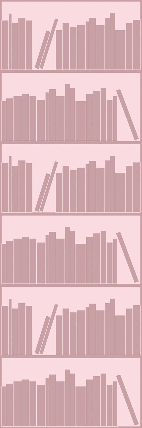
Bookshelf Outline - Grey & Pink (left) Bookshelf Outline - Blue & Pink (right)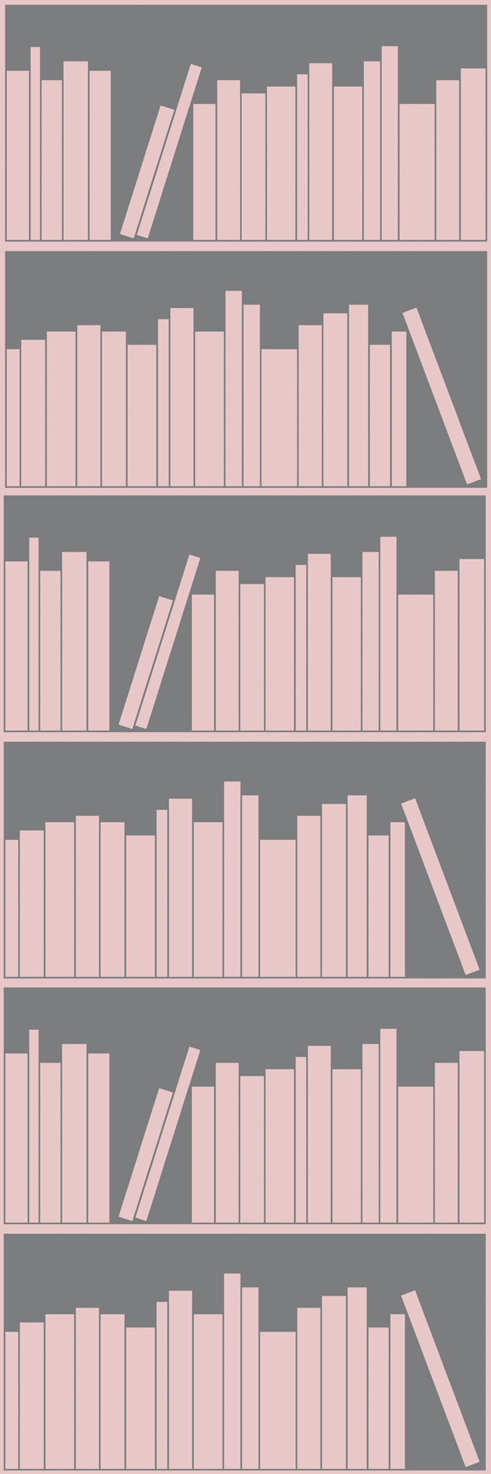
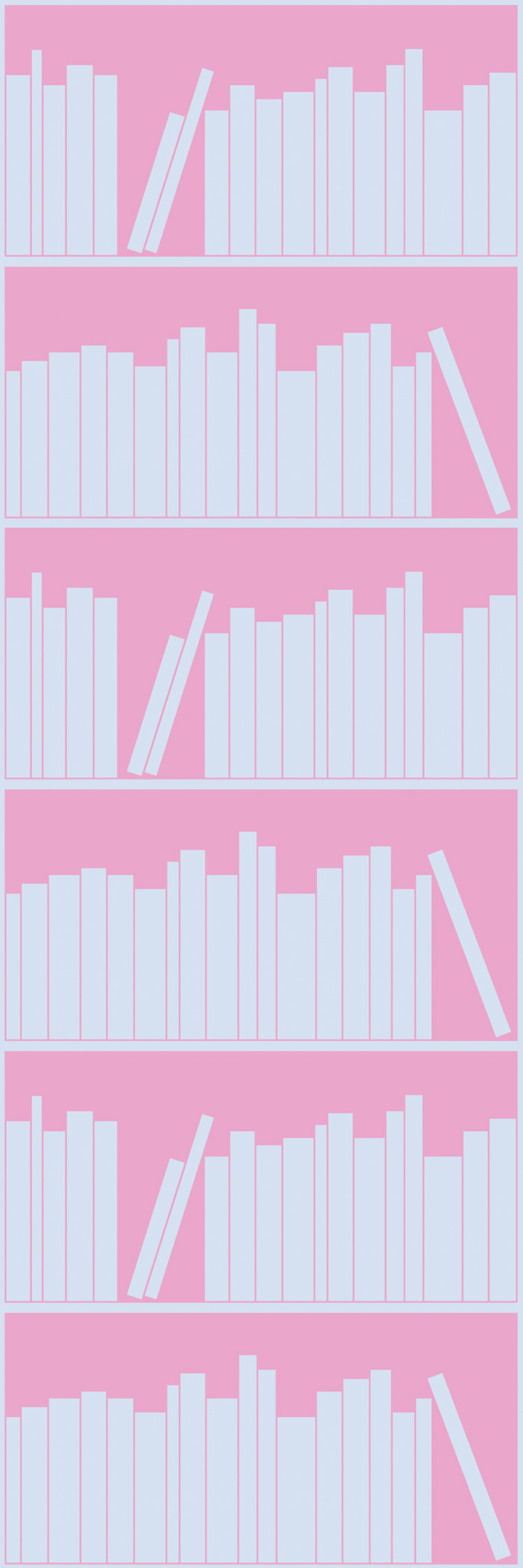
Bookshelf Outline - Petroleum & Aquamarine (left) Bookshelf Outline - Pink & Grey (right)
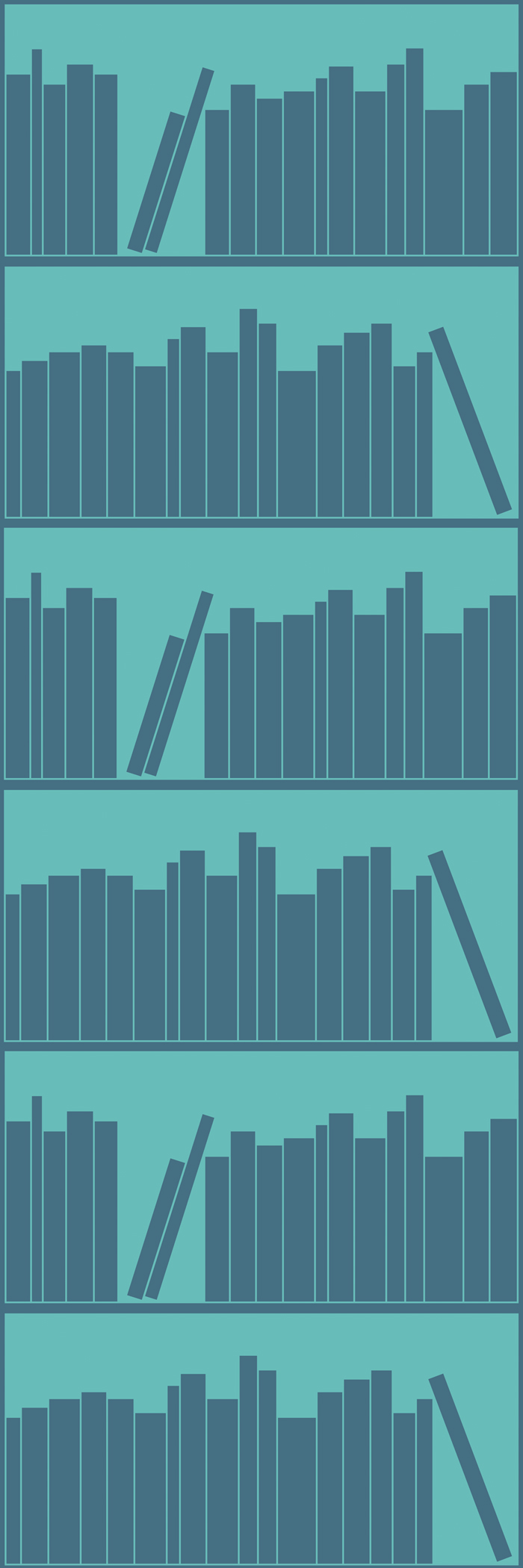
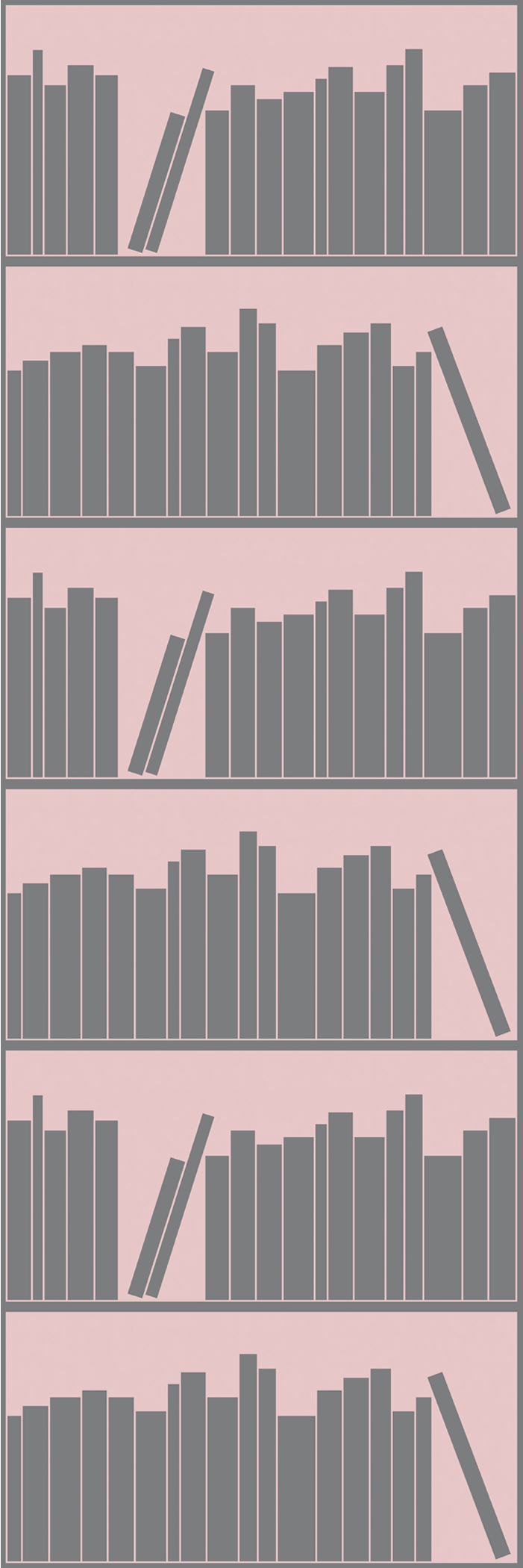
Bookshelf Outline - Tonal Aquamarine (left) Bookshelf Outline - Tonal Grey (right)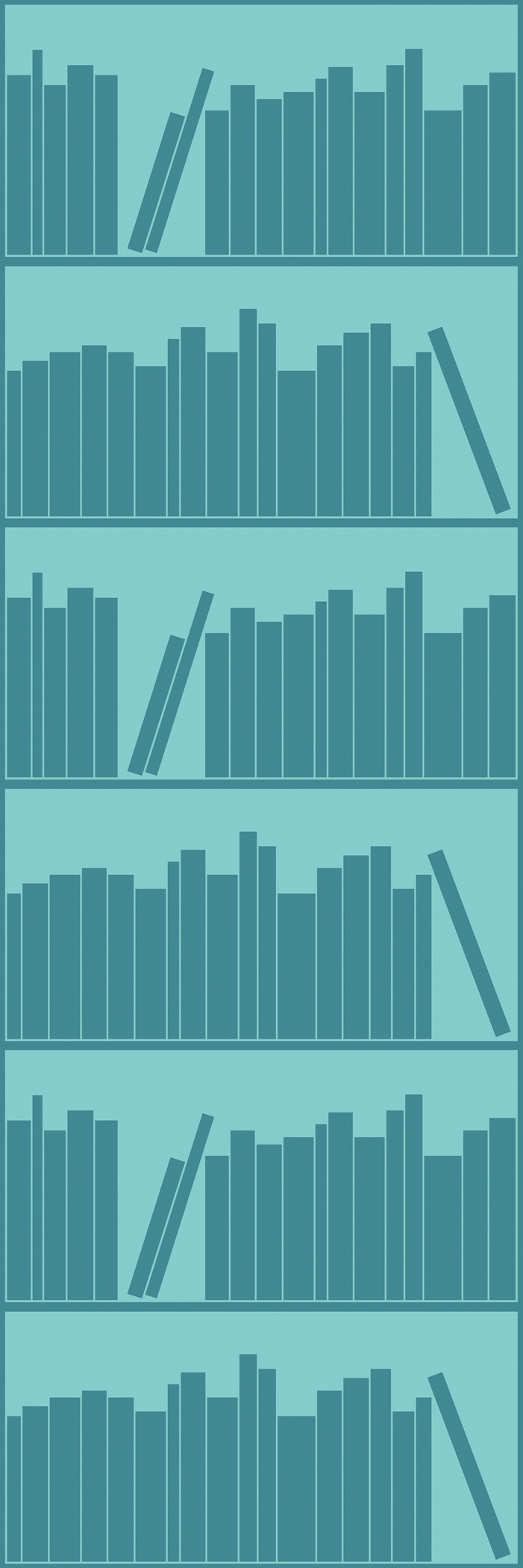
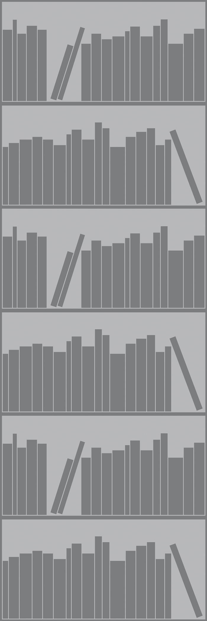
Bookshelf Outline - Tonal Navy (left) Bookshelf Outline - Tonal Pink (right)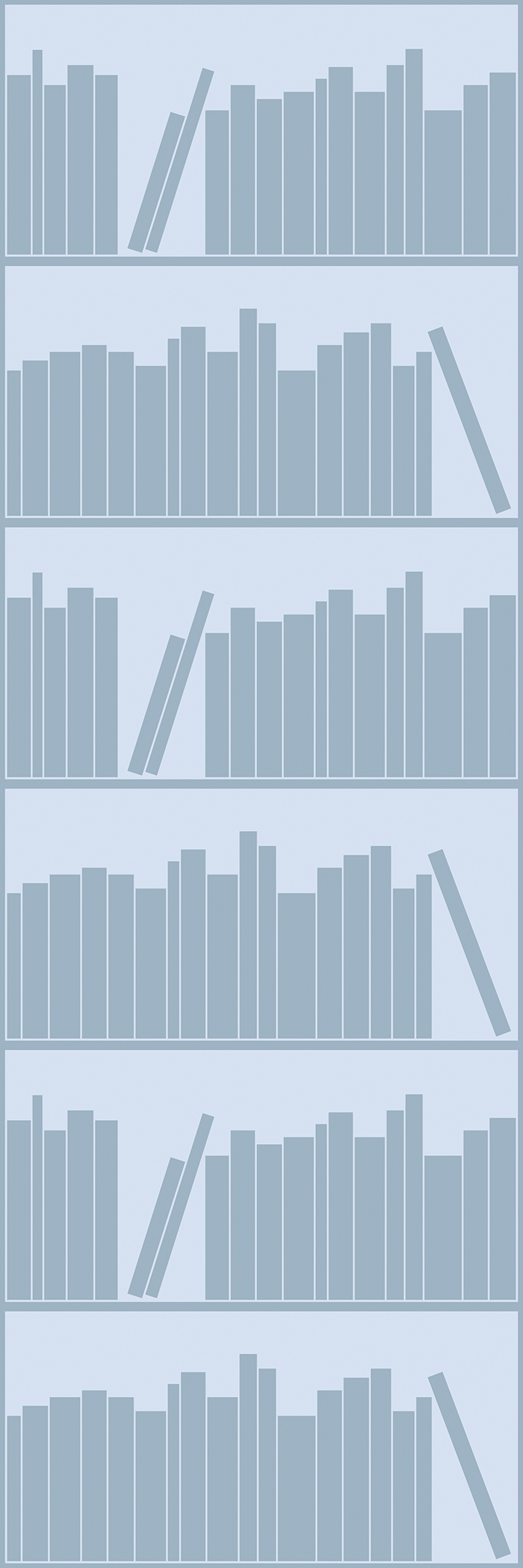
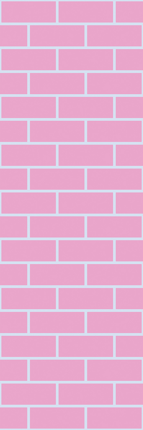
Brick Outline - Tonal Light Blue (left) Brick Outline - Pink & Light Blue (right) 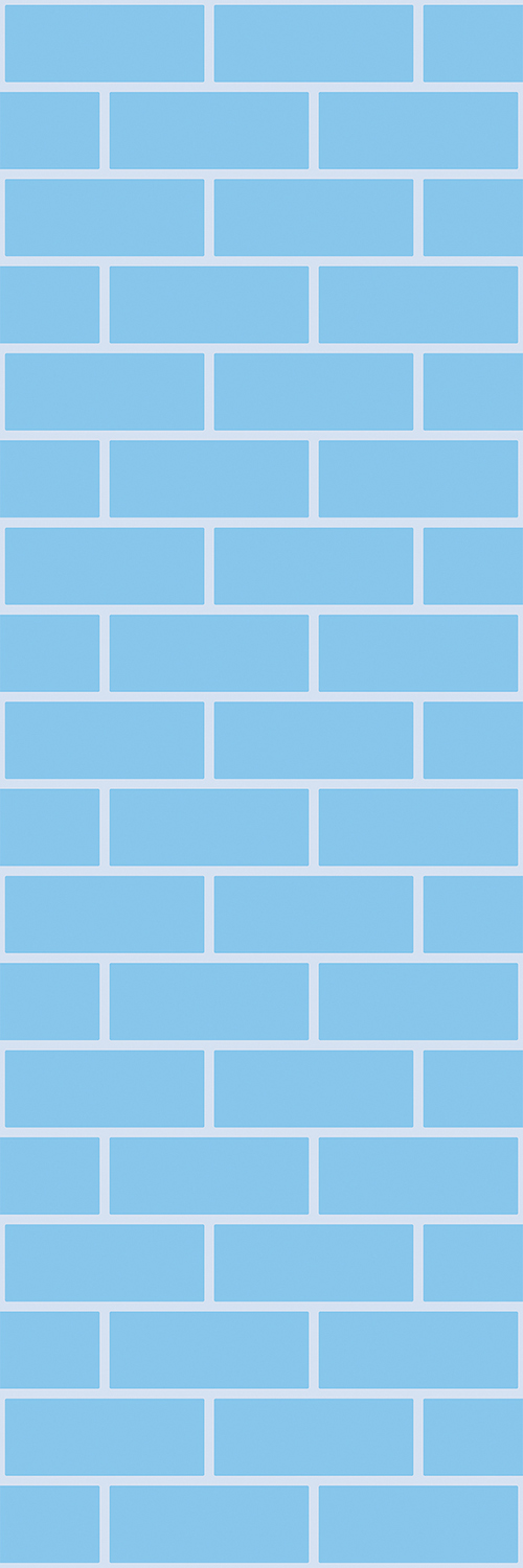
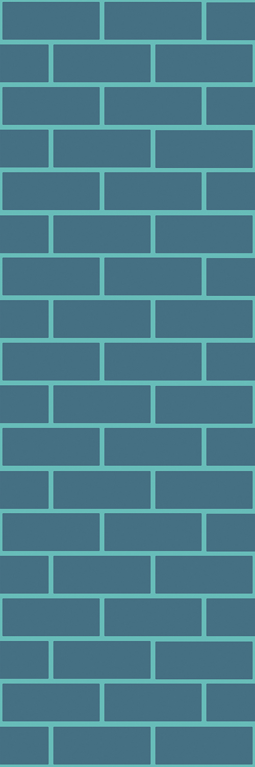
Brick Outline - Petroleum and Aquamarine (below)
Panel Outline - Petroleum and Aquamarine (left) Panel Outline - Light Blue and Pink (right)
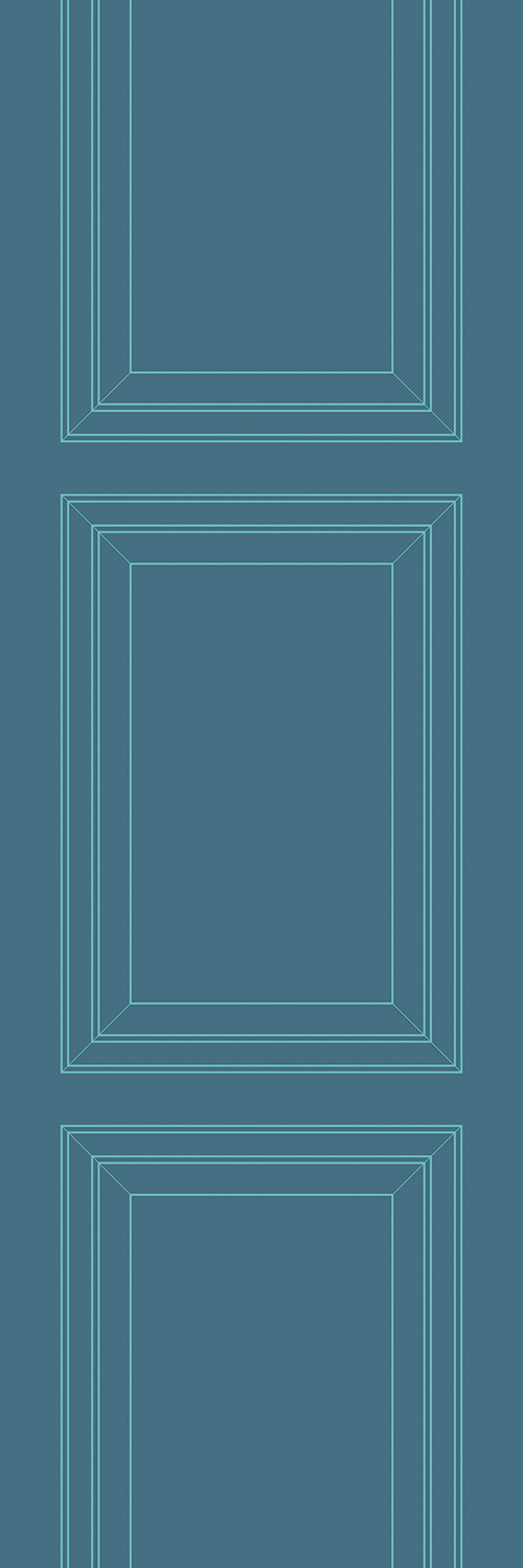
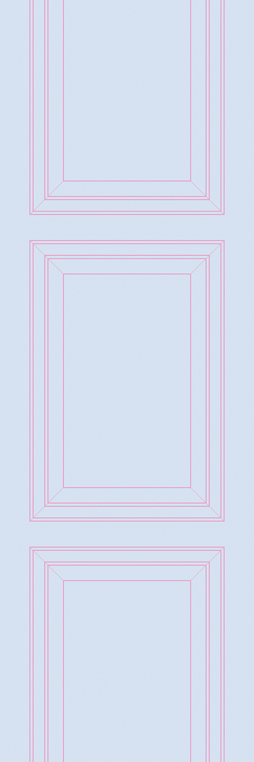
Panel Outline - Tonal Grey (left) Panel Outline - Pink and Grey (right)
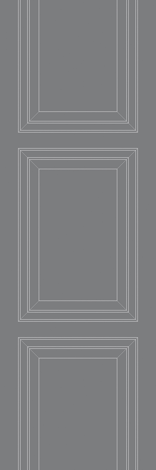
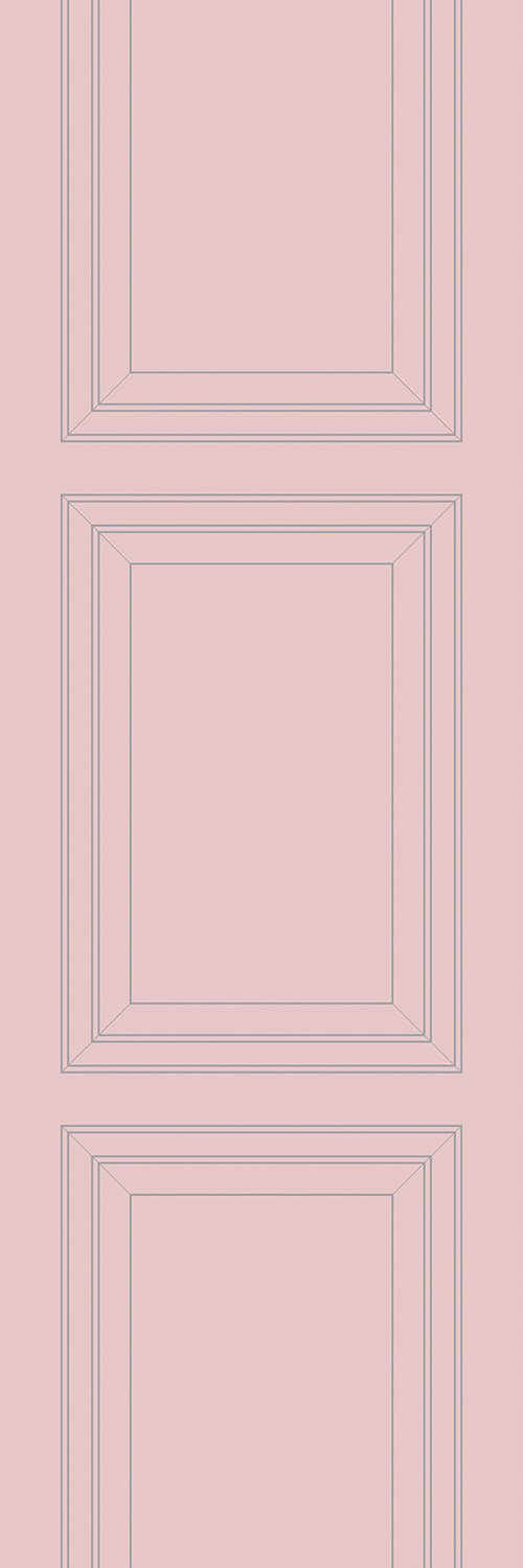
Quilt Outline - Light Blue and Pink (left) Quilt Outline - Petroleum and Aquamarine (left)
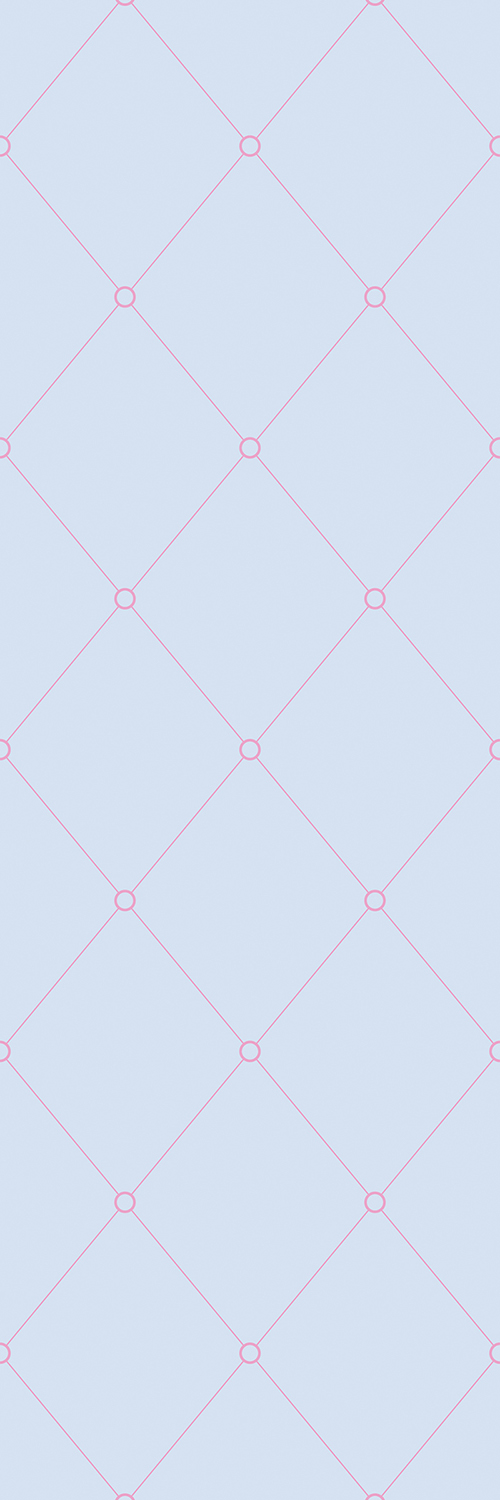
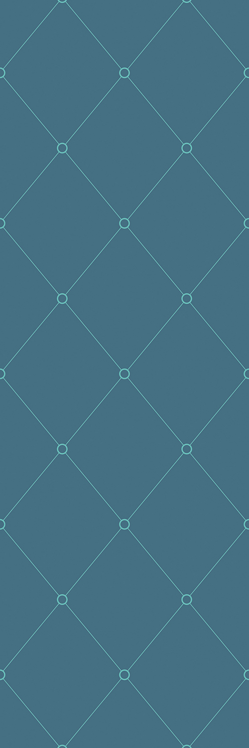
Quilt Outline - Grey and Pink (left) Quilt Outline - Pink and Grey (right)
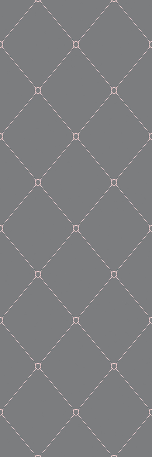
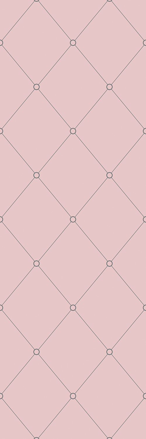
Quilt Outline - Tonal Sage (below)
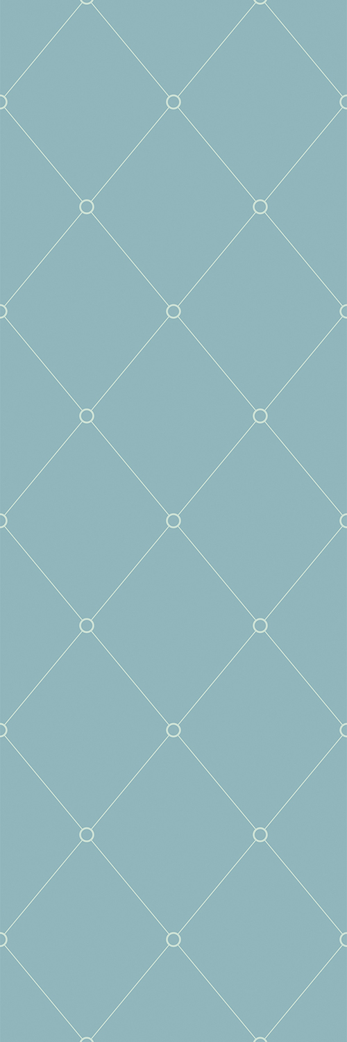
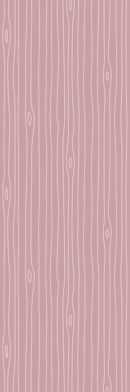
Woodgrain Outline - Grey and Pink (left) Woodgrain Outline - Light Blue and Pink (right)
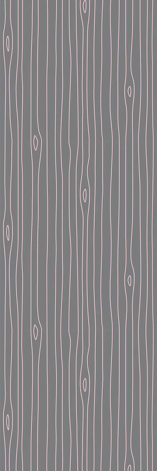

Woodgrain Outline - Petroleum and Aquamarine (left) Woodgrain Outline - Tonal Pink (right)
