Classic Blue For 2020 - Pantone Colour Of The Year
18th Jan 2020
The Past Three Years Of Pantone Colours: Did They Hit The Mark?
The New Year could see you finally getting round to purchasing the luxury wallpaper you want to have in your downstairs bathroom, but what colour are you going to choose?
Each year American colour company Pantone announces a colour of the year, which is supposed to epitomise the trends that coming year.
It recently announced its colour of the year for 2020, Classic Blue, so does this one hit the mark?
Classic Blue for 2020
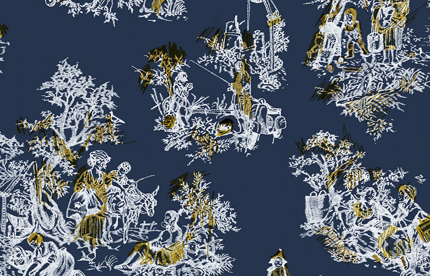
Classic Blue is a colour that has been on the rise for a number of years now. Alongside blue-blacks, indigos and peacock purples, Classic Blue has been an important part of the jewel tones trend.
It is a bold colour, but some have argued that this year’s choice plays it too safe. Others ask if that is necessarily a problem in a world that requires increasing diplomacy, democracy and calm.
"A boundless blue evocative of the vast and infinite evening sky, Pantone 19-4052 Classic Blue encourages us to look beyond the obvious to expand our thinking; challenging us to think more deeply, increase our perspective and open the flow of communication," said Leatrice Eiseman, executive director of Pantone Color Institute.
"We are living in a time that requires trust and faith," she added. "It is this kind of constancy and confidence that is expressed by Pantone 19-4052 Classic Blue, a solid and dependable blue hue we can always rely on."
The organisation does acknowledge the colour’s universal appeal, calling it ‘everybody’s favourite’. Is this an admission they have played it a bit too safe this year?
Living Coral for 2019
The company may be playing it safe after it was criticised for its ‘tone deaf’ choice last year. Living Coral was a bright, lively pink colour supposed to reflect the colour of vibrant undersea coral.
Except coral reefs across the globe are facing serious threats to their continued existence with coral bleaching a growing problem. Coral bleaching occurs when the oceans heat to the point where the living organisms that make up the coral can no longer survive, and the coral dies.
There are examples of coral bleaching all over the world, including in Australia’s great barrier reef. In fact, The Great Barrier Reef has lost half of its living coral since 2016. It was this that lead to Australian design studio Jack and Huei proposing Bleached Coral as the colour of the year for 2020. Designers there pulled out the shade P 115-1 U as the one that most closely matched the colour of bleached coral.
The pair argued that it was the creative industry’s responsibility to bring global issues to a greater audience saying: "The colour is meant to guide, inspire and shape the world of design (and beyond), while reflecting the state of the world as we know it – the rich tapestry of an entire year, distilled into a single colour.”
They feel that if the public were made more aware of the impact of climate change and other global issues it would impact the choices they make about the items they buy, behaviours they exhibit and changes they make.
Ultra-violet 2018
This bold choice in 2018 was chosen to inspire creativity and experimentation. The company said it had been chosen to represent “what is to come”. Its links with spirituality and mysticism insinuated it was forward-thinking colour for the planet to ponder on.
"The selection of Ultra-Violet speaks to our shared desire for deeper understanding in an increasingly complex landscape, and our eagerness to experiment to reach that level," said the company.
Earlier that year the company had issued a very similar hue to commemorate Prince’s death, and others linked the colour to David Bowie and other artists who had died that year.
It’s name is interesting as ultra violet is not visible to the eye, yet the Pantone colour itself was a deep, dark jewel purple.
At the time the colour was most commonly seen in fashion with violet rinse hair hugely popular among fashionistas. Notoriously difficult to achieve the look obtained notoriety among hairdressers for the amount of work it took to strip out any existing colour. Still the look is seen around a couple of years later reflecting the longevity of this trend.
The colour is probably the closest to this year’s Classic Blue, coming as it does from the jewel colour trend that has been seen for a number of years now.
It will certainly be interesting to see what is chosen next year, and if the company manages to hit the mark globally.


